
For a shop, café or practice reached on foot, the first question is not simply how large the logo should be. It is where someone first sees the business. A person across the street, a visitor walking beside the windows and a customer looking for the door all see different parts of the frontage. One sign may not serve all three views equally well.
Walk the route before choosing the sign
Begin a short distance away and approach from both directions. Note when the business name becomes visible, whether neighboring signs compete with it and whether the entrance is obvious. Repeat the exercise from the other side of the street when safe. Take photographs at those points, rather than collecting only a close-up of the wall.
This is a useful starting point for a Carrboro business sign or any storefront where customers arrive along the building. The actual frontage and sightline should guide the design; the town name alone cannot tell you which format will work.
Give each sign one clear job
A building sign can establish the main business identity. A blade sign projects from the frontage so the name can be seen along the sidewalk. Window vinyl can identify the door and carry close-range information such as hours or an appointment instruction. These formats can work together without repeating every message.
- Use the main identity for the name people need to recognize.
- Reserve small, changing details for a location customers can read comfortably.
- Keep the entrance and any essential visitor instruction easy to distinguish.
If every surface lists the same services, phone number and slogan, the frontage can become harder to read. Start with the minimum information needed at each stage of arrival.
Check the building as carefully as the artwork
Photograph masonry, existing brackets, cables, sign bands and window divisions. A design drawn over a blank rectangle can overlook real attachment points or architectural features. Ask the property manager for current sign criteria and clarify which approvals apply before treating a drawing as ready for fabrication.
For an established building, discuss whether existing hardware should be assessed for reuse or replaced. The condition and suitability of a bracket or mounting surface cannot be confirmed from its appearance alone.
Think about the view after dark
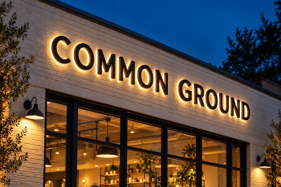
If customers arrive in the evening, consider how they will recognize the frontage when daylight fades. Discuss illumination, surrounding lighting and the availability of power. Channel letters are one option, but lighting should support the intended reading distance and approved design rather than simply make every element brighter.
Bring an approach, not just a preferred product
A useful brief includes the logo, several approach photographs, the proposed sign position, property criteria and the date the business needs to be identifiable. If you already prefer a format, explain why. That gives the design conversation a purpose and makes alternatives easier to compare. Use our sign planning checklist to collect the details, then ask about your storefront.