A restaurant can have three different arrivals happening within a few minutes: a couple looking for the host, a customer collecting a prepaid order and a delivery driver trying to find the handoff counter. Giving every visitor the same long instruction at the front door makes the entrance work harder than it needs to. Start by separating recognition from the next decision.
Map the routes your restaurant actually uses
Sketch the route from the sidewalk or parking area to each destination. Mark where dine-in and collection traffic split, where a queue forms and whether a door has a purpose that is not obvious. Include the arrangement on a busy evening, with patio furniture and waiting guests in place. A route that looks clear before opening may feel quite different during service.
For a Carrboro restaurant sign project, send photographs of the frontage from both walking directions, plus the view a visitor sees while choosing a door. Those photographs explain the problem more clearly than an isolated picture of the logo.
Let the main sign identify the restaurant
The permanent building identity should be easy to recognize as a single name. Avoid adding a list of ordering methods, specials and collection instructions to the main artwork simply because space is available. A clear name helps someone confirm the destination; close-range signs can explain what happens next.
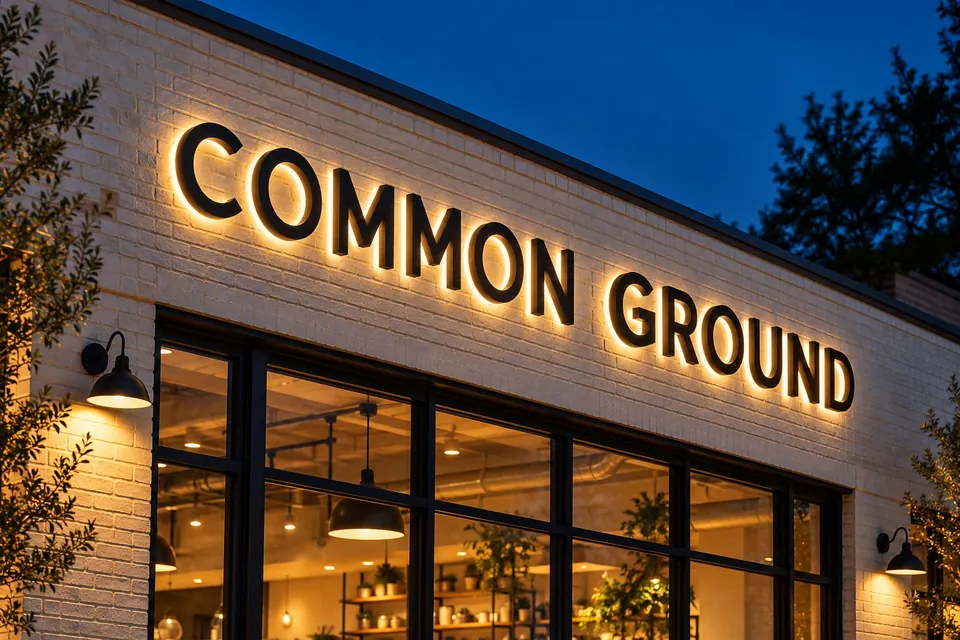
Channel letters may suit an evening-facing identity, while other frontage arrangements call for a different format. Decide what the sign must communicate and where it will be read before selecting the construction. Review the daytime view as well as the illuminated appearance.
Use the same words customers receive when ordering
If the confirmation message says “collect at the side counter,” the sign should not introduce an unrelated term such as “dispatch.” Write a short vocabulary list with the person who manages orders. Decide whether you use pickup, collection, takeout or curbside, then keep the relevant wording consistent.
- Identify the destination before introducing an arrow.
- Place the instruction before the customer must choose a route.
- Repeat a short confirmation at the destination when needed.
- Remove instructions for collection arrangements you no longer offer.
A sign cannot resolve a process that staff handle differently each day. Settle the handoff procedure first so the physical wording reflects the service customers will receive.
Keep the door useful without covering it in messages
Window and door lettering can carry hours, an entrance label and a short pickup instruction. Build a hierarchy rather than using the same size for every line. Consider which information matters while the restaurant is closed and which only matters to someone already standing at the door.
Review the glass with nearby menus, reservation notices and payment stickers included. A clean new layout can quickly become crowded if everyone adds a separate notice. Agree which messages belong on a replaceable surface and who approves changes.
Check the handoff from outside to inside
Once someone enters, the next destination should use the same language as the exterior instruction. A collection sign above the correct counter can be more helpful than a second large logo beside the host stand. Check whether customers waiting for orders obscure the sign for the next person arriving.
Ask a colleague unfamiliar with the layout to follow a sample order confirmation from the approach to the handoff point. Observe where they hesitate rather than explaining the route for them. Use those observations to refine the brief for your restaurant signage. When the route and wording are settled, ask for a restaurant sign quote with the photos, logo and approved instructions.