
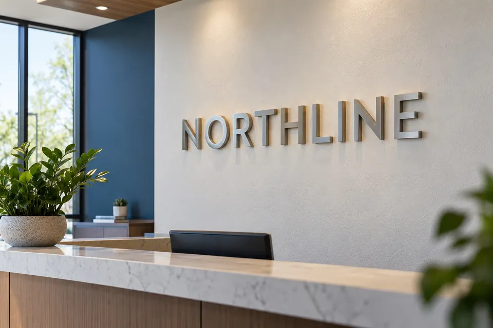
A first-time dental patient may be looking for the correct suite, checking whether they have reached reception and deciding where to wait. The practice may also want to limit direct views through a glass partition. These are related design questions, but they should not be forced into one oversized graphic. Treat identity, instructions and privacy as separate layers with a shared visual style.
Start at the suite door, not behind the desk
Walk the route from the building entrance to the practice. Note any shared corridors, similar doors and competing tenant names. Confirm that the name on the door matches the appointment information and the name the receptionist uses. A practice with several clinicians needs a deliberate decision about whether the primary identity is the practice name, an individual provider or both.
For dental signs in Hillsborough, useful photographs include the approach to the suite, the door in its normal open or closed position and the first view inside. Each image reveals a different arrival decision that a close-up logo photograph leaves out.
Give the reception wall a focused role
A reception sign can confirm that the patient has arrived at the right practice. It does not need to carry appointment instructions, a full treatment list and a slogan at equal prominence. Start with the approved name and logo, then decide whether a short supporting line adds useful information.
Review interior sign options against the actual wall, desk position and lighting. Place a scaled outline on a photograph so the sign can be judged with furniture and artwork in view. An identity that appears modest on a blank drawing may feel substantial over a small reception desk.
Evaluate privacy from the relevant viewpoints
List the views the practice wants to soften: from the public corridor toward the desk, from a waiting chair toward a work area or between an entrance and a consultation space. Photograph those views from the positions people actually occupy. The desired treatment may differ for seated and standing sightlines.
Do not choose a band height only because it looks balanced in a flat elevation. Discuss the glazing, the intended coverage and the appearance from both sides with the graphics supplier. The final treatment should be selected for that specific surface and brief. Decorative film alone should not be treated as a complete answer to the practice’s privacy responsibilities.
- Identify the exact glass panels to be treated.
- Mark the areas that should remain visually open.
- Separate the logo placement from the required coverage.
- Review a material sample in the actual light before approving a broad application.
Make check-in instructions easy to update
A printed form, a kiosk or a reception desk may become the first stop as the practice changes its process. Put that instruction on a suitable updateable sign instead of embedding it permanently into the main identity. Use direct wording that describes the current action, such as checking in at reception, rather than a paragraph of internal procedure.
Glass lettering and graphics can coordinate the door and partition treatments, while a separate desk or wall message handles a changing instruction. Ask staff which questions they repeatedly answer, then decide which can be resolved with a short sign at the right location.
Review the complete arrival before approving
Check the proposed name, door information, reception identity and privacy treatment as one sequence. Include ordinary furnishings, standing patients and the desk screen position in the review. The useful question is whether someone can recognize the practice and understand where to go without being presented with unnecessary information.
Our dental signage overview covers the main project elements. To discuss your practice signs, bring approach photographs, the approved practice name, brand files and a short description of the views you want to keep open or soften.