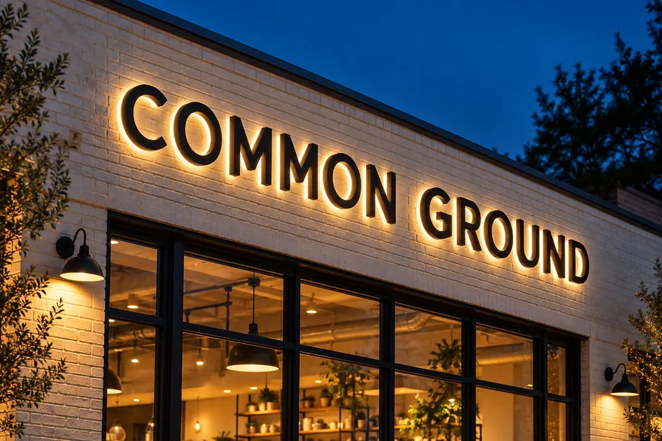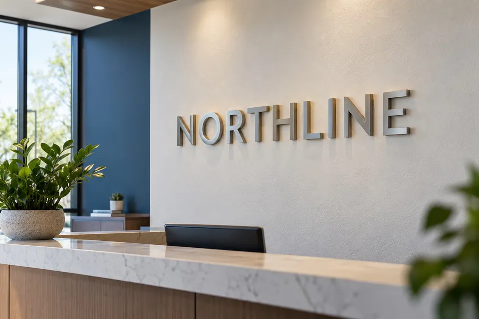
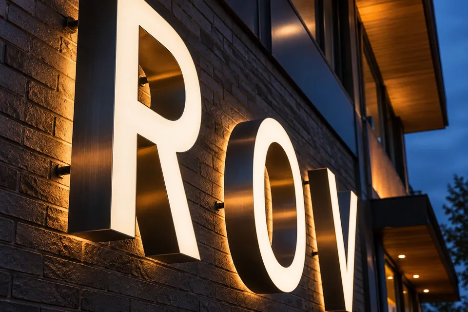
Two familiar illuminated sign formats can produce very different results. Channel letters form the name or logo with individual three-dimensional elements. A cabinet sign presents the graphic on the face of an enclosure. Choosing between them involves more than a preference for one photograph over another.
Decide which part of the brand needs emphasis
Individual letters can make the shape of the name central to the design. They can create space between characters and let the building remain visible around the identity. A cabinet introduces a defined sign face, which can help organize a logo and supporting graphic within a single shape.
Look at your artwork at the scale it will be seen. Fine details, long descriptors and delicate letterforms may need to be simplified for either format. The goal is a recognizable identity from the intended view, not a perfect reproduction of a small business card.
Read the building before comparing finishes
The available sign band, wall surface, existing attachment points and property criteria influence the design. Individual letters may use a mounting arrangement that needs to be considered as part of the appearance. A cabinet has its own depth, proportions and attachment needs. Ask to understand how the complete assembly will sit on the facade.
For a Mebane building sign, for example, bring a wide view of the frontage and the approach from parking. That context helps judge whether a compact sign face or a more spread-out letter treatment makes the business easier to identify.
Compare lighting as an effect, not just a feature
Illumination changes how materials, color and letter shapes are perceived after dark. Discuss the intended effect, nearby lighting and the hours when recognition matters. Ask how the proposed sign will look in daylight as well as at night; an illuminated sign spends part of its life switched off.
Available power, routing and access belong in the scope. Avoid assuming that an existing illuminated sign means a replacement can use every part of the same arrangement without inspection.
Include future changes in the decision
A business may eventually update its name, logo or tenant information. Ask which components could be changed and which would need replacement. Also discuss maintenance access and who will be responsible for the surrounding surface if the sign is removed later.
- Will the logo or wording stay the same for the foreseeable future?
- Does the property have a coordinated sign standard for several tenants?
- Can the sign be reached for servicing without disrupting the premises unnecessarily?
The answers are more useful than assuming one format is always cheaper, easier or more durable. Those judgments depend on the actual specification and site.
Ask for a comparison against the same brief
If you are considering both formats, provide the same artwork, target position and visibility goals for each. Compare the proposed size, illumination, mounting, removal work and installation scope together. Our quote preparation guide explains what to gather. Then discuss the two approaches with the building and brand details in hand.